A multi-page, visual website for desktop and mobile.
Strong and confident website pages convey the assurance, simplicity, and ease with which they sell their products and showcase the community value they offer.
The website's energy mirrors the quirky, friendly, and humorous atmosphere of the actual bike shop. This is effectively portrayed through photographs of the store, staff, and scattered bike parts throughout the shop. The website's scrappy design aims to replicate the bikes they sell, many of which are rebuilt using donated or new bike parts.
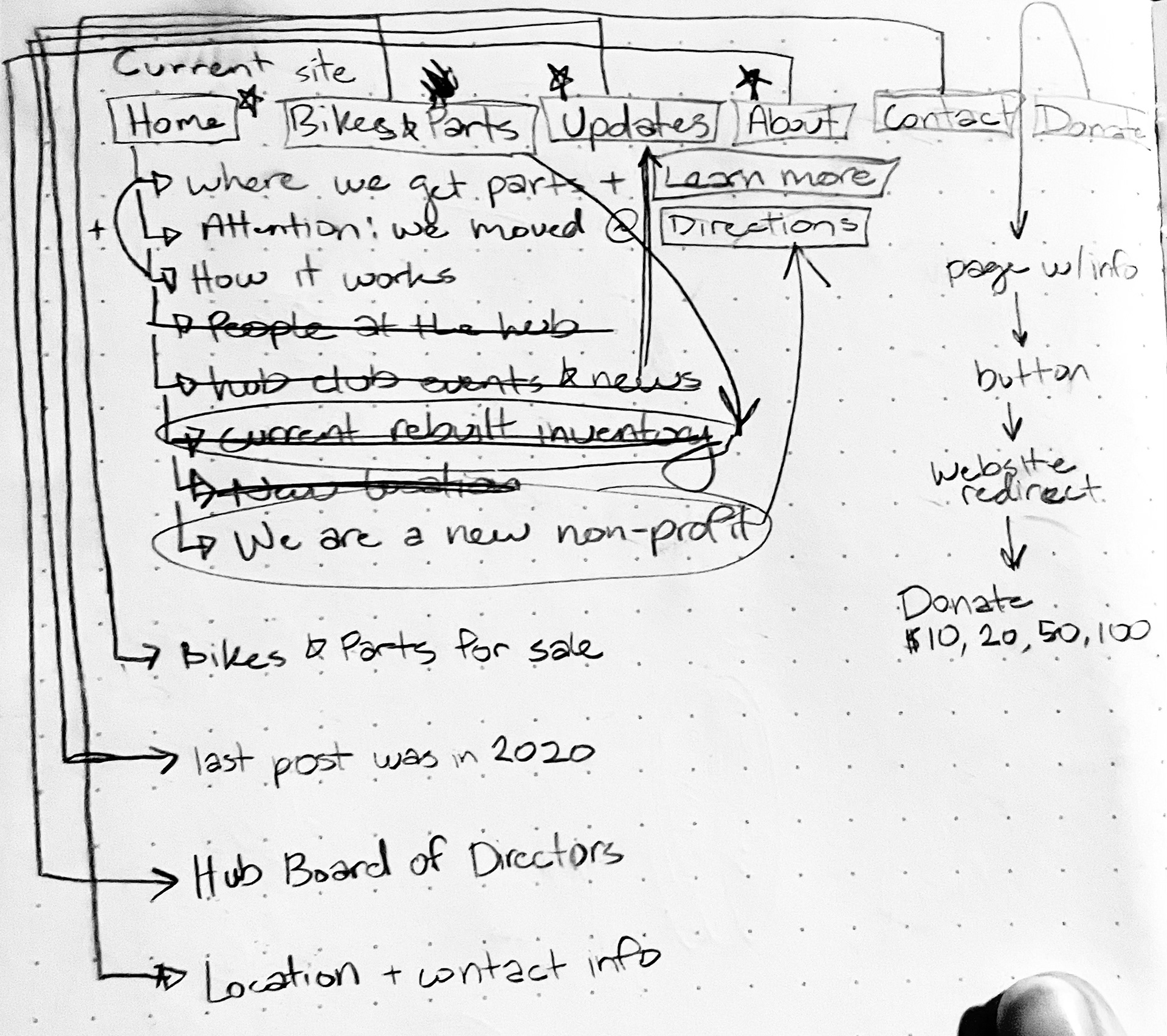
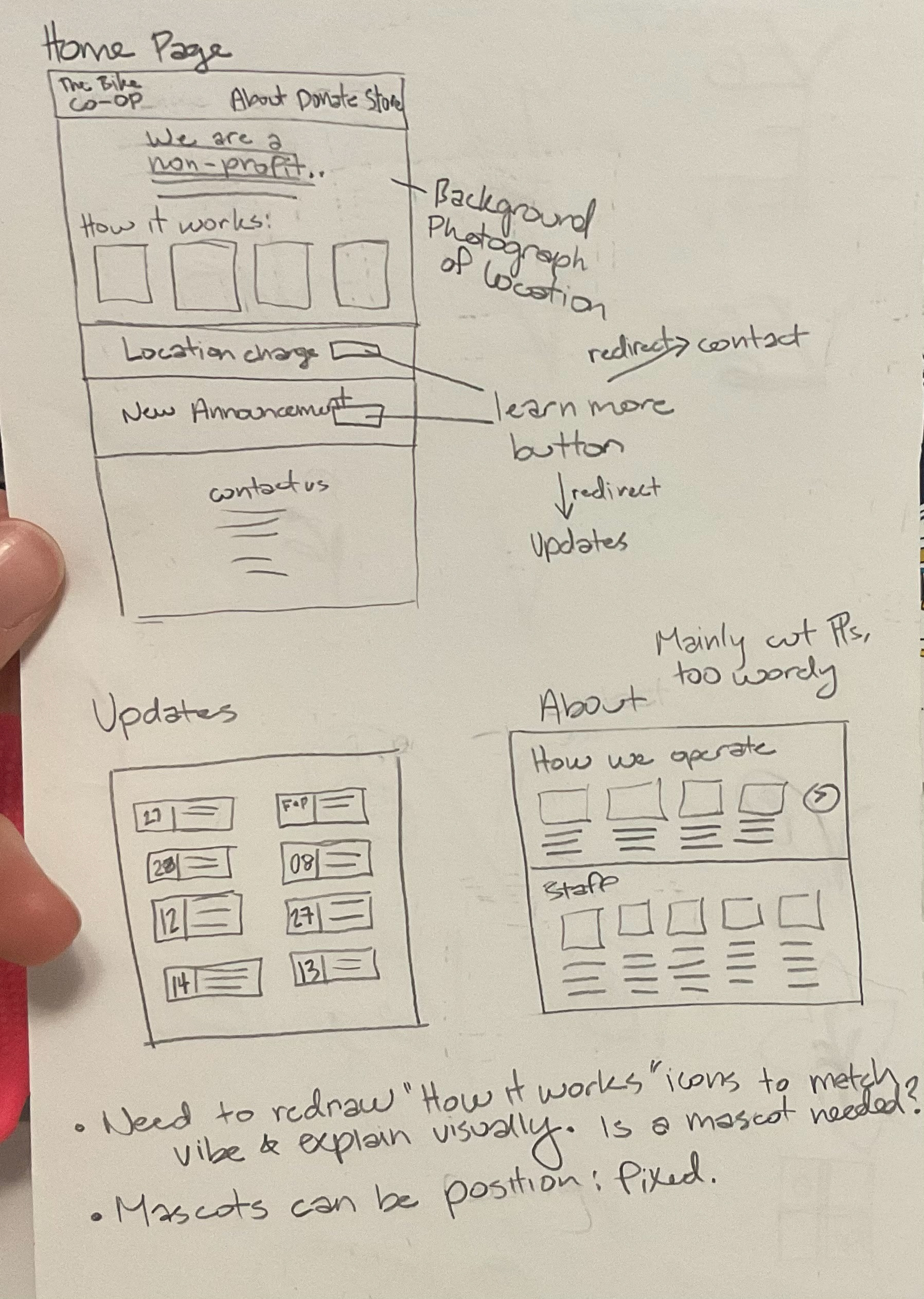
Site Map and Wireframing
Moodboard
Personas and Scenarios
Storage Biker - Beck, 23 years old
Goals/needs: Never rides her bike. Has a really old one that she wants to repair and possibly sell.
Frustrations/Fears: she’s being scammed out of a better deal because she knows nothing about bikes. Feels insecure about bike knowledge and its culture.
Urban cyclist - Jeff, 37 years old
Goals/Needs: Cycles to save money on car expenses for political reasons. Builds community through cycling—the most reliable bike for the budget. See a shop’s inventory vs. online shopping. Community cycling events through the shop. Bikes are made with a good ethos and with cycling needs in mind.
Frustrations/Fears: Finding relatively affordable quality bicycles. Having the infrastructure in the city to ride safely and finding bike sizes.
Recreational Cyclist - Sarah, 40 years old
Goals/Needs: Bikes occasionally. Cycles for exercise/outdoor time. To ride with friends, and purchase a reliable bike package with helmet and essential accessories. To see shop inventory vs. online shopping. Customer service that will address specific recreational biking questions. Good sales on bikes so multiple bikes can be purchased for family/partner
Frustrations/Fears: finding enough safe spaces to ride on the path. Finding bike sizes for women and more average-height people
Adventure/Mountain Biker - Matthew, 19 years old
Goals/needs: Avid biker, who wants to be involved and learn about bike repair. Looking to intern. Cycle for exercise/outdoor time, ride with friends and have a bike shop that carries a desirable bike for riding goals. To see shop inventory vs. online shopping. Staff that is knowledgeable about off-road cycling gear. The social network for group rides
Frustrations/Fears: Finding shops that carry mountain bikes that are budget-friendly. Finding bike sizes. Finding social networks for riding opportunities.
Habitual Biker - John, 52 years old
Goals/Needs: Biking for years, knows what he needs in quick repairs. Usually bikes in the morning before work and many hours on the weekends. Enjoys local community involvement.
Frustrations/Fears: Poor organization of web design. Inability to see all products online, and custom order options. Lack of relevant or updated community events.
Neighborhood lapper - Sammy, 7 years old
Goals/Needs: Bikes with his friends in the neighborhood. Must achieve "cool" status.
Frustrations/Fears: the bike graphics aren’t cool enough. Mom and Dad will disapprove of how an ‘epic’ bike looks.
Concept Evolution and Visual Design
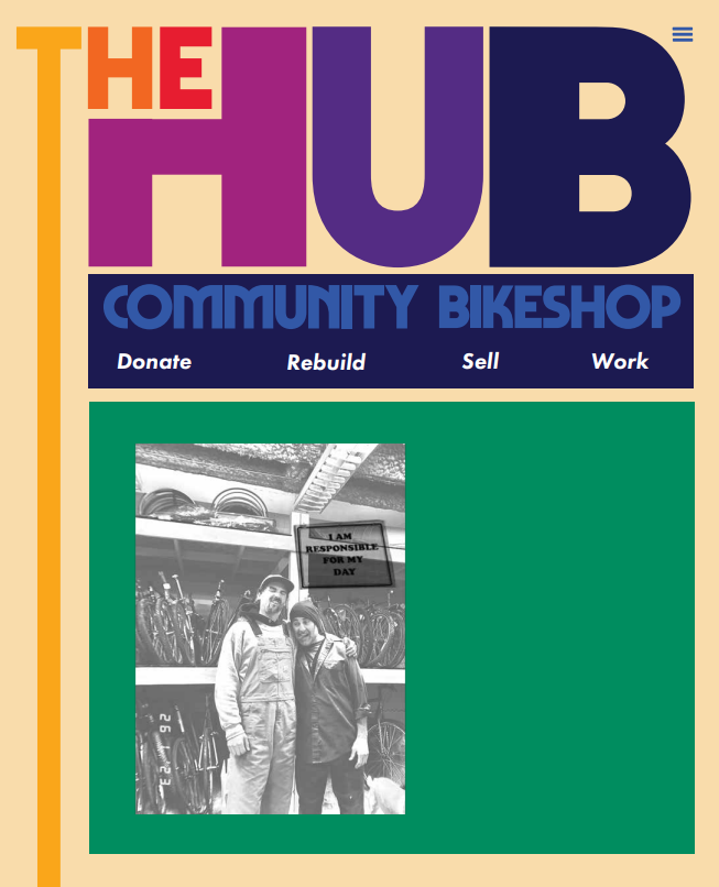
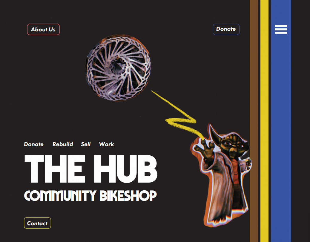
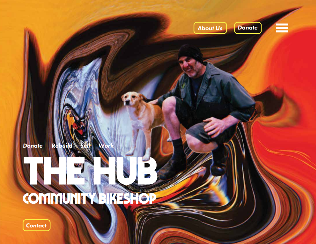
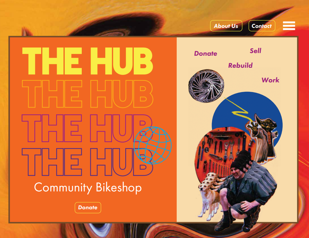
Priorities were to keep the 90s feel without it feeling outdated or cluttered. Communicate community and the empowerment and ease of owning a bike.
User flow was a lot easier to navigate when the cluttered information was removed from the homepage. The only things that needed to be on the homepage were the navigation bar, News button Donate button, location change announcement, store hours, and how to contact them.
Inspire curiosity. Happily in the 90s. DIY + loose + scrappy feel. Film camera + colored stripes that mimic bike designs. Witty words. Mix and match.
Makes for a good conversation piece.
Gritty. Foraged. Scrappy.
dirty rags. guilty pleasures. grease pit. broke spoke.
donate your spare brains/parts.